import numpy as np
import matplotlib.pyplot as plt3 Python 9.5
from sklearn.model_selection import train_test_split
from sklearn.linear_model import LogisticRegression
import sklearn.model_selection as skm
from sklearn import svm
from sklearn.metrics import confusion_matrix, f1_score
import ISLP
from ISLP.svm import plot as plot_svm
from sklearn.model_selection import GridSearchCV
import pandas as pd
3.1 9.5
Generating data
Let me first generate some data set
np.random.seed(42)
n = 2*500
p = 2
rng = np.random.default_rng(10)
x1 = rng.uniform(size = n) - 0.4
x2 = rng.uniform(size = n) - 0.4
X = np.stack([x1, x2], axis = 1)
y  = x1**2 - x2**2 > 0.1**2
As you can see, the sample size is increased. In addition, x1 and x2 coordinates were shifted by 0.4 instead of 0.5. This was done to make data set little less symmetric, so that logistic regression predictions are non-trivial
Here is the plot of the original points. As you can see, two classes are actually located in three different regions, so it does not seem trivial to seperate them
2
plt.scatter(x1, x2, c = y)
plt.axvline(0, color = "black")
plt.axhline(0, color = "black")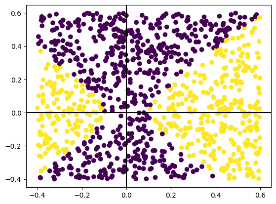
It is convenient to define some plot functions to reduce the code repetition
# Plots scatter plot with f1 score
def plotOne(X, y, predictions, ax, testQ = True):
    ax.scatter(X[:, 0], X[:,1], c = predictions)
    type = "Test" if testQ else "Train"
    ax.set_title("{:s}: f1= {:.2f}".format(type, f1_score(y, predictions)))
    ax.axvline(0, dashes = [2, 2], color = "black")
    ax.axhline(0, dashes = [2, 2], color = "black")

# Plots both train and test
def genPlot(model, ax1 = None, ax2 = None, X = X, y=y, random_state = 42, superTier = None):
    if ax1 is None:
        fig, (ax1, ax2) = plt.subplots(1, 2, figsize = (10, 5))
    X_train, X_test, y_train, y_test = train_test_split(X, y, test_size = 0.33, random_state = random_state)
    model.fit(X_train, y_train)
    # Train
    predictions = model.predict(X_train)
    plotOne(X_train, y_train, predictions, ax1, testQ=False)
    # Test
    predictions = model.predict(X_test)
    plotOne(X_test, y_test, predictions, ax2, testQ=True)
    #
    if superTier is not None:
        plt.suptitle(superTier)
    plt.show()
Let me first try Logostic regression
model = LogisticRegression()
genPlot(model, superTier="Logistic Regression")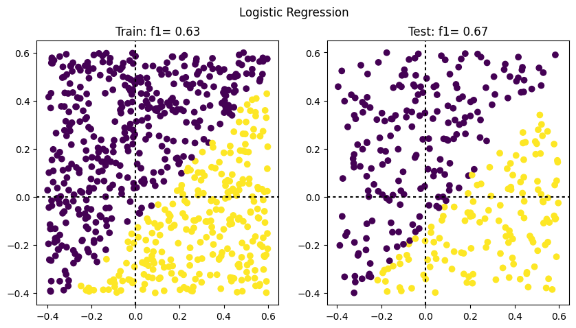
As you can see, there is only one line that separates two classes of the predictions. It makes sense since our model is linear
When some extra (non-linear) variables the prediction accuracy is much better
x1_2 = x1**2
x2_2 = x2**2
x1_x2 = x1*x2
log_x2 = np.log(x2+1)
X_full = np.stack([x1, x2, x1_2, x2_2, x1_x2, log_x2], axis = 1)
model = LogisticRegression()
genPlot(model, X = X_full, superTier="Logistic Regression, Extra Features")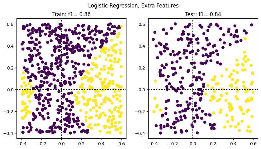
Results of the Support Vector Classifier with linear kernel are not very impressive: we again have only one separaring line. This coild be expected since the model is still linear
svm_linear = svm.SVC(kernel="linear", C=0.1)
genPlot(svm_linear, superTier="SVM Linear")
Polynomial (quadratic) kernel, on the other hand gives very nice results:
svm_poly = svm.SVC(kernel="poly", degree=2)
genPlot(svm_poly, superTier="SVM Poly")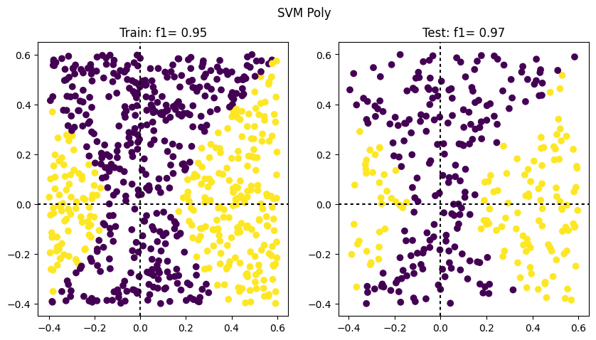
This is not surprising since the separation line in our data set was indeed quadratic
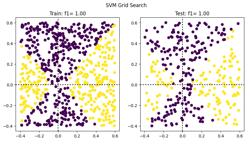
GridSearch also votes for quadratic kernel
param_grid = {'C': [0.001, 0.01, 0.1, 1, 10, 100],
    'degree': [1, 2, 3, 4, 5]}
svm_model = svm.SVC(kernel = "poly")
svm_grid = GridSearchCV(svm_model, param_grid, cv = 5)
model = svm_grid.fit(X, y)
svm_grid.best_params_
{'C': 100, 'degree': 2}Found by this search best estimator shows perfect results
genPlot(svm_grid.best_estimator_, superTier="SVM Grid Search")